Showing posts with label 201 Concept Process. Show all posts

Sunday, October 14, 2012

Bathroom Design

The uniting space was designed to give the patron a welcoming, open scene. This was accomplished with Warm colors and horizontal elements, with a hint of white paint to offset all the warm colors in the space so that it does not seam to small. 

Concept Statement


IDEA GENERATOR

THE LYRICS FROM THE SONG, HOME, FROM THE WIZ, IS THE GENERATOR FOR MY DESIGN. THE SONG CARRIES MANY POINTS THAT SEEM TO BE UNIVERSAL THROUGHOUT MANY DIFFERENT CULTURES AND THEIR HOMES.

FORM-GIVERS

MOST HOME OWNERS SEEM TO LEAD IN THE DIRECTION OF DESIGN HARMONY; A RELAXING PLACE TO GROW OLD.  HORIZONTAL ELEMENTS CREATE A RELAXING SPACE AND CIRCULAR ELEMENTS SEEM TO UNIFY IT AND ITS INHABITANTS. WARM COLORS ARE WELCOMING, RELAXING, AND COMFORTABLE. HARMONY CAN AND WILL BE ACHIEVED WITH THE RIGHT APPLICATION OF THESE ELEMENTS.   

APPLICATION
   
ACCESSIBLY LEADS THE DESIGN BY KEEPING IN MIND UNIVERSAL FUNCTION AND CODES. THIS FACT MAKES IT USABLE FOR MANY DIFFERENT TYPES OF PATRONS. FOR THE interior of the bathroom, unity was created through the use of tiles and painted walls, the tile partners seemed to transformed into the wall paint, this was done similar to the weaving seen in the concept model. Warm colors where used to make the space welcoming. . WHITE PAINT IS CHOSEN TO GIVE THE ILLUSION OF A LARGER SPACE, BALANCING THE INFLUENCES OF THE WARM COLORS.


Throughout this project I learned that one needs to think of these spaces in a new way, a way that makes the space functional and ecstatically pleasing. People do not like to be in a space that is accessible and looks accessible, they want to be in a space that is accessible but that dose not look it. This takes away the stigma that is though of when thinking of universal design.


Monday, October 8, 2012

Kitchen Plan


This kitchen plan was infulenced by my current concept statement below


Idea Generator

The lyrics from the song, Home, from the Wiz, is the generator for my design. The song carries many points that seem to be universal throughout many different cultures and their homes.


Form-Givers

Most home owners seem to lead in the direction of design harmony; a relaxing place to grow old.  Horizontal elements create a relaxing space and circular elements seem to unify it and its inhabitants. Warm colors are welcoming, relaxing, and comfortable. Harmony can and will be achieved with the right application of these elements.   


Application

Accessibly leads the design by keeping in mind universal function and codes. This fact makes it usable for many different types of patrons. Round tables and furniture are chosen to influence unity through the use of circular elements. The warm color scheme and kitchen soffit make the space cozy. White paint is chosen to give the illusion of a larger space, balancing the influences of the warm colors.  The kitchen is design to encompass two cooks; open space and implied walls are designed to create a connection to people in the dining area with a separation of space with strong horizontal elements. 

     I learned from first hand experiences  why kitchen are so hard to design, hard but fun. They can be the most expensive room in a home, and the most impotent. I need to make sure for the next time, to manage my time a bit better so that I can make a better presentation. I think that my rendering came out nice and I will work harder to make them even better for the future presentation I will have to do.

Sunday, September 9, 2012

Final Concept Model

     This is my final concept model. I worked with many different elements and principles of design with this one. Horizontal, Diagonal, Curved, Radial, Rhythm Through Repetition, to create Harmony. My key words for this where: Growth, Harmony, Relaxation. Different aspects of my design can be seen when looked at in different directions to create the KEY WORDS I listed. Keeping what I said in mind, this model should speak for it self.

    I would change how busy this model is if I were to do this again. But over all I am happy with how it came out.
Review these two links to see the process that got me to this point. 2-D Concept Sketches and 3-D Concept Abstartion


3-D Concept Abstartion

     These two to the right where made first. I Started by extruding my 2-D abstraction. Can you tell me which two these ones are?  
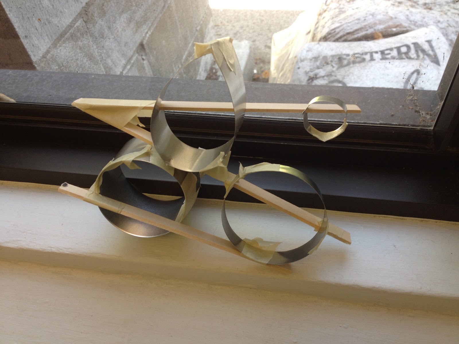
     The one to the right was made to see how repetition through different sizes would work. Playing around with the idea of people growing up in a home.

     The one to the left was paying around with diagonal and vertical elements with different materials.
     This one with the four different elements was made to see how different sized objects could work to create harmony.
     These to picture are of my last model. I worked with curves in this one more. Hard to convey my idea with the tape everywhere.
Uris Giron

2-D Concept Sketches

     These five sketches came from abstraction a song (Home, from The Wiz Film). I though about what home meant to use as a hole, not just person to person. So what do most homes around the world have/are? In my mind home seemed to be a place where one goes to relax, find peace, think, feel welcome, and loved. I though about these words when creating my abstractions.

     I looked to the Elements and Principles of design for some insight of these words. Horizontal elements represents stability, restful feel and look. Diagonal elements represent movement, visually active and
dynamic, gives a space a scene of relaxation. Curved elements represent gentle movement or uplifting. Unity through repetition, Radio balance, emphasis through the uses of color. Using all of these elements and principles of design to create harmony in a space.

     I used these elements and principles to guide my 2-D partis. These five seem to be the best abstraction that express or are close to expressing harmony. These partis will help me with my 3-D
 abstractions.

Uris Giron