Showing posts with label Project. Show all posts

Monday, July 30, 2012

Postor


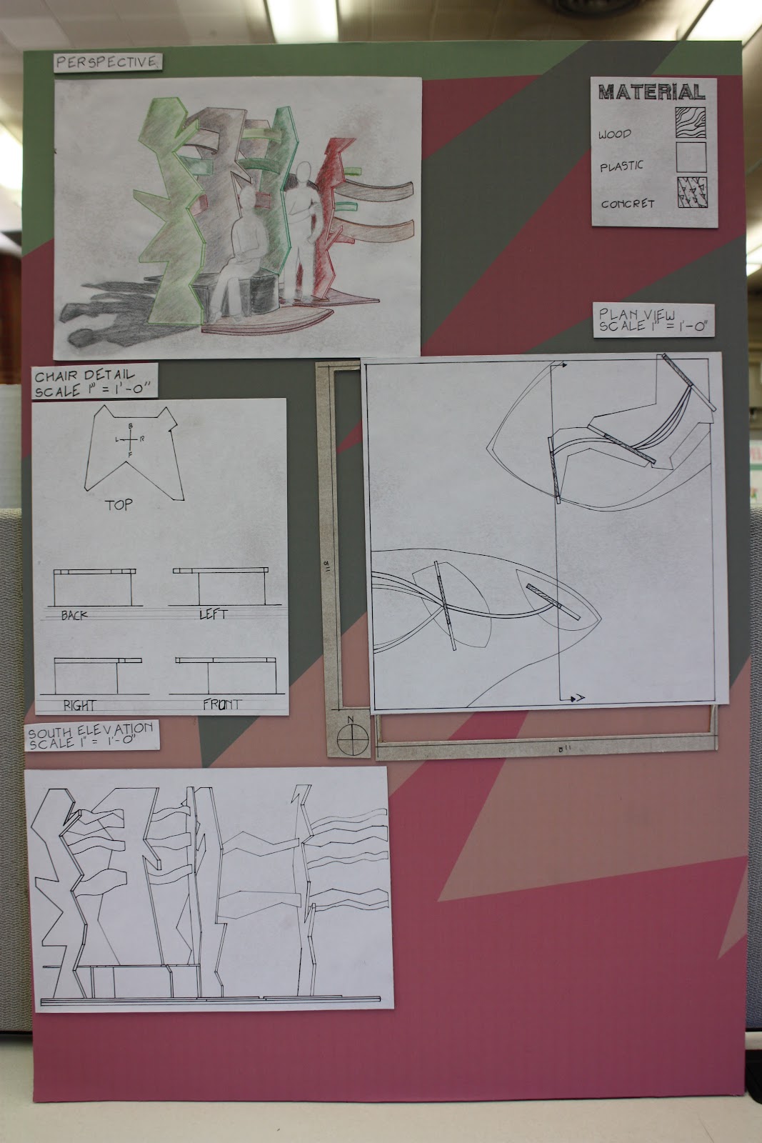
     These are my posters for my project presentation. When I was designing this poster I wanted to keep it as hand crafted as possible, keeping the human craft evident. Next time I design a poster I will make sure to make the underlining grid more visible and the elements of the posters more lined up. All in all, make this poster has helped me remember what I wanted to accomplish with this project, what the message I wanted to convey with the model. When I was drawing my technical drawing I ran out of velum paper and had pens that where drying out. I wish I would have seen this coming because mixing velum and tracing paper on a presentation poster does not look clean and having broken pen line does not look professional. A great skill I learned from working on this project was how to work with color pencils.  They where never a media I payed much attenuation to, but coloring my perspective with it was quiet interesting. I learned that using complementary colors can create a deeper shadow and how to make the transition from light to dark. This project called for me use all the skills I learned in ID 103 from drafting to organization. This project was something I needed to do to make sure I knew and could use all I have learned.

Friday, July 27, 2012

Final Model


These are picture of my final project model. I took them around 12pm to see how the shade and shadow plays off the structure. The overall model has an interesting form, but their is one thing I would like to change about this design. That one thing is the design of the setting structure. It seem to distract from what is really impotent in the model, the flow and relaxing horizontal elements. All an all, I like the design I could not have wished for a better one.

Tuesday, July 17, 2012

Concept Model


These images are of my concept model for my project. This composition took me some time to 
design, but I feel content about it. I wanted this abstraction to have free flowing elements.
As well as a geometric shape and an emphases through  the use of colors. I feel that this model captures the  abstract design I wanted to give it. The design is similar to the way the artist I am 
studying, would abstract a project (Milton Stricker) in my opinion. 
Top


     I wanted each different view of this abstraction to call attentions to a different element and principle of design. One can see how the free flowing lines are visible from the top view of this image, how the diagonal elements are affecting the composition and interception the fluid look of this design. 


Side


From this view one can see how nonobjective it is even though it was 
abstracted from a piece of wood.
the color scheme of this abstraction is quiet pleasant to the eyes, it is a split complementary with red and green, and it also uses different hues of those colors.

 Front


     Now I ask you a question, readers. In what climate can you see this abstraction in?

     Similar to what Milton Stricker believed, he thinks that each type of abstraction belongs in a particular location. More geomatric abstraction belonged in hot climantes where more free flowing lines belong in mild climates  

Tuesday, July 10, 2012

3-D Models

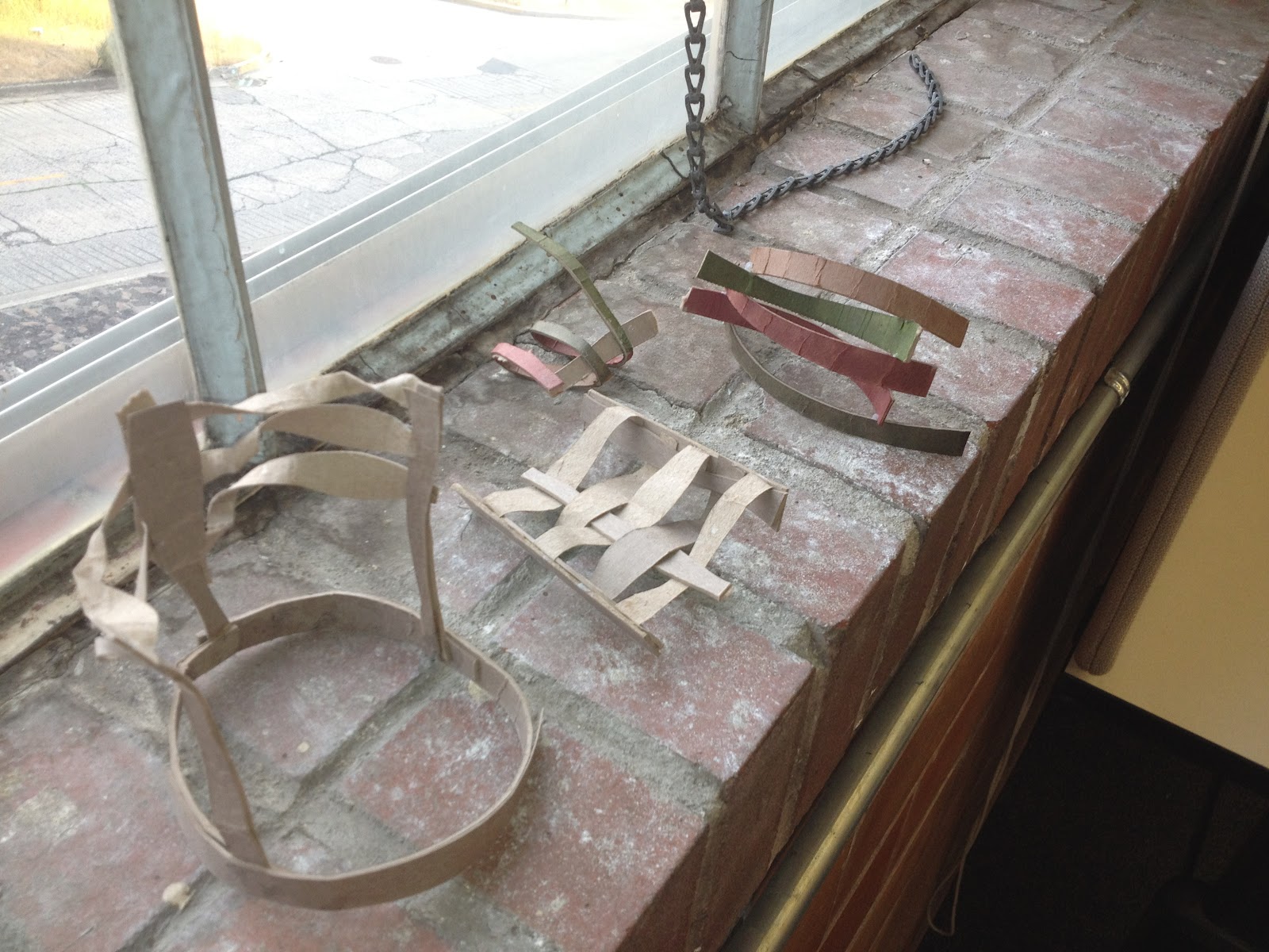
     This is an image of my organic object of a piece of wood.
     These 3-D abstractions are from my first abstract sketch seen on my last blog post ORGANIC ABSTRACTION. For the first one on the left I extruded the pattern from the 2-D to 3-D to give it the illusion of still being 2-d if seen from a plan view. Then I adjusted the angles that the pieces were in to give the object a more dynamic look, I did this from all of these abstractions for this sketch. I took that dynamic look to an extreme for the one in the front right corner. It created an interesting object, but it seem like to much chaos. Then for the one in the middle back,  I when back into extruding the object but giving it an organic curve that the pieces were connected to. I like the composition of this one, it may come in handy for my final design.  


     These two abstraction are of my last two sketches from my ORGANIC ABSTRACTION post. They are both similar in the sense that they both have strong horizontal elements.  the top one is more fluid and the bottom one is more geometric, both seem good in their own way. I like the more fluid 3-D abstractions' free flowing look, but I also like the more geometric ones' order and balance they they carry. My next step is to make some 3-D abstractions with all three sketches, combining some elements with others.
These bottom three abstractions are a combination of all three sketches. I will be working more on a better composition of all of their similar elements. I want to keep in mind the strong diagonal and horizontal elements that my artist has in his work for my abstractions. 


Saturday, July 7, 2012

Organic Abstraction

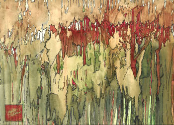
     The image above is of a piece of wood I found on my walk home from class. For a few days I was working on abstracting this piece of wood in a similar manner that the artist I researched would, Milton Stricker, for my 103 Interior Design class.  I made about 60 abstractions of this piece of wood, when was was abstracting it, I kept in mind two quotes of my artist, Milton Stricker. One of them was
       "The final design test: is the building beautiful, in harmony
        with its surrounding, and does it fiction well?"
Milton Stricker,
and the other quote was
       "Organic design is compounded of a multiple of the abstracted design elements
        and then reunified into a new dimension defining art, structure, and human values."
Milton Stricker,
 
     Keeping in mind these quotes, I believe helped keep my abstraction down a similar road to my artist style of abstracting. I  chose 3 of the 60 abstraction to work on further in my design process, to create some 3-dimensional abstractions.

     The following abstractions are a combination of many of my earlier abstractions I worked on. Then I reflected on them to come up with these 3 more developed abstractions. 
  
     This abstraction has many similar elements to my artist. I used red and green hues, strong vertical, and diagonal elements, and patterneds influenced by the shape of the piece of wood.

The pattern is similar to Milton Strickers' Taliesin West Abstraction.    


     This abstraction has strong horizontal elements with free flowing lines. The white void space complements the different hues of green and red, as well as the black bordering lines. It has similar elements to the abstraction below.

This abstraction is similar to Milton Strickers' abstraction of Mount Saint Helens.


     The abstraction has horizontal, diagonal, nonobjective, rhythm elements, and emphasis through the use of color. It gives a calm, relaxing look, and it has a complementary color scheme and different hues of those colors.


I hope to narrow down these abstraction to one or even a combination of all three, with my 3-D design phases.

Uris Giron

Sunday, July 1, 2012

Milton Stricker

This poster was made to inform the viewer about Milton Stricker, an architect in Seattle Washington. He was an architect that to this day, amazes me with his story of how he became an architect and how he finally capture his creativity. His views on many things are similar to mine. As an early designer, he always wanted to know how an artist can call upon their creativity. This is a question I ask myself every day, well I think every artist as themselves this question. when he attended Carnegie Hall for architecture, he came up with this conclusion,
        Art is an Abstraction
        Architecture is an Art
        Architecture is an Abstraction
                                     Milton Stricker
This makes logical sense, this view of what architecture was to him at this time was taboo, during his early years of architecture school most of the professors wanted their student to design in a box. He said that most of the best project in his classes looked like a box. He did not let this discourage him on his views of architecture as an abstraction. In his last semester for architecture school, Milton dropped out of school to join Frank Lloyd Wright's fellowship program. He went to Taliesin West in Arizona to plead to Mr. Wright asking him to let him join his fellowship. He said no at first but then let him in free of charge for a year. He was finally given a chance to practice his abstract architecture. This leaded him to his style of architecture that is similar to Mr. Wright's "Nature through Abstraction". He became a great architect that never stopped learning his craft and only became better and better with time.

   This man got me interested in design through abstraction. He is a person I wish I could have met before he passed. He seemed like a great man that has truly become happy with his craft. I hope one day to discover my style of design and share it with the world.    

   
Uris Giron