Showing posts with label Assignment. Show all posts

Tuesday, July 10, 2012

Photoshop Room


This was an interesting assignment for me to work on, we turned a 2-dimensional sketch of a 1-point perspective into a an interesting space with a some what believable room. This project was know small feet, I had to use many different tools to make this room, as well as many different images. But to tell you the truth, it was a lot of work, but not really that hard if one was to look at it one step at a time. Like I said before it was not hard just a lot of work. 

I made this assignment a little be hard on my self because I did not work more on developing what I wanted the space to look like. I worked a little on my thumbnail sketch, but I should have put more time into them. In the end I the assignment was completed, I just need to remember to develop my vision more in the future.

Uris Giron

Monday, July 2, 2012

Patterns within a Pattern

     Patterns within a pattern, that's a deep thought to think about, but I gave it a go with this image above. The image was created on Photoshop, I used an already made pattern, just a simple two shade pattern and modified its shape to what I wanted it to look like. I wanted to include seven images in my pattern from my  Elements and Principles of Design  posters I made a few days ago. 

Can you tell me what images I used? 
     
     So I made sure I picked my spaces carefully. I made this images' color composition a tetradic one. The colors seemed to express the culture I researched for my E and P design posters.  

Uris Giron

Sunday, July 1, 2012

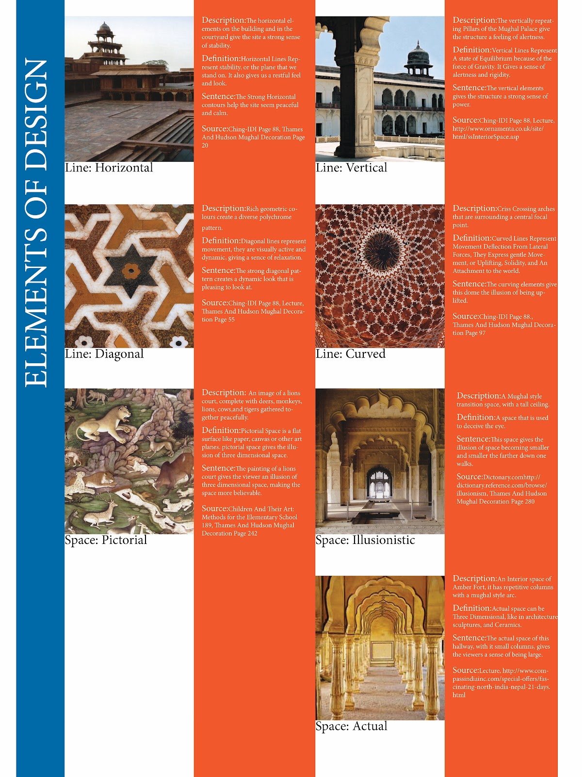
Elements and Principles of Design


       The Elements and Principles of Design, this was a fun poster to put together. I was given the chance to look at these concepts again. It is always good to go back to the foundations of design. I can honestly say that I have forgotten about some of these concepts before when it came to designing a project, but making this poster, I think, will help me remember them when I need to use them. For my most recent project, I made sure to run it throw all the elements and principles of design to get a greater understating of what the object really was that I was looking at.
 
       I used the colors blue and orange, because they are complementary colors. The blue gives the viewer a calming feeling when the orange makes the viewer more alert. I made the colors run vertical because I think that it would make the viewers more attentive to the information that was on the posters.

Uris Giron

Friday, June 29, 2012

Wacom, Farm house on the Palouse

       This piece was done about a week ago while experimentaing with a Wacom tablet on Adobe Illustrator. I abstracted this picture of a farm house on the palouse. I wanted to break down this image to a more basic form. I figured that using a limited amount of colors, I could break down this image into its simplest form. This exercise was a great way for me to play around with a Wacom tablet. I have an HP Touchsmart laptop, but for some reason it did not feel the same as the tablet. The Wacom tablet's stylus was a different twist on drawing, different but good.

       This image is of the same image I abstracted above, I used a tool I learned about on another project I was working on. It is quite an interesting tool on Illustrator, it is call "live trace". This tool can abstract an image in a number of ways. It is a tool to remember when in the need of a creative push.

Uris Giron